In today’s digital age, the importance of mobile-friendly design website cannot be overstated. With the rapid proliferation of smartphones and tablets, more people are accessing the internet on mobile devices than ever before. Therefore, if your website is not optimized for mobile users, you could be missing out on a significant portion of your potential audience.
In this blog post, we will explore the numerous reasons why mobile-friendly website design is crucial in today’s online landscape.
What is a Mobile-Friendly Design Website?
A mobile-friendly website design, also known as a responsive web design. Is a design approach that ensures a website can adapt and display properly on various screen sizes and devices, including smartphones, tablets, and desktop computers.
Key features and principles of a mobile-friendly website design include:
- Flexible Layout: The website layout and elements should adapt to different screen sizes and orientations. This may involve using fluid grids and flexible images to ensure that content is presented in a readable and visually appealing manner.
- Media Queries: CSS (Cascading Style Sheets) media queries are used to apply different styles or layouts based on the screen size and capabilities of the device. This allows for tailoring the design to the specific needs of mobile users.
- Touch-Friendly Design: Mobile devices primarily use touch screens, so mobile-friendly designs incorporate larger, easily tapable buttons and navigation elements. This makes it easier for users to interact with the site on a touchscreen.
- Readable Text: Text should be legible on smaller screens without the need for users to zoom in. Responsive typography adjusts the font size and spacing to maintain readability.
- Optimized Images and Media: Images and media files should be optimized for quick loading on mobile connections. They may also be resized or replaced with smaller versions on smaller screens.
- Condensed Navigation: Mobile-friendly websites often use a simplified or collapsed navigation menu that can be expanded when needed. This conserves screen real estate and makes it easier to navigate on smaller screens.
- Fast Loading: Mobile users are often on slower data connections, so optimizing the website for speed is crucial. This can involve minimizing HTTP requests, reducing unnecessary scripts, and using content delivery networks (CDNs).
- Device Compatibility: Ensure the website works well on a variety of mobile devices, including different brands and models. This may require testing on a range of devices or using emulators and simulators.
- Cross-Browser Compatibility: In addition to mobile devices, a mobile-friendly website should be compatible with various mobile web browsers, such as Chrome, Safari, Firefox, and others.
- User-Friendly Forms: If your website includes forms for data input, ensure they are easy to complete on a mobile device with appropriate form fields and input options.
The importance of mobile-friendly design has grown significantly with the increasing use of smartphones and tablets for web browsing. Search engines like Google also give preference to mobile-friendly websites in their search rankings.
Why is a Mobile-Friendly Website Important?
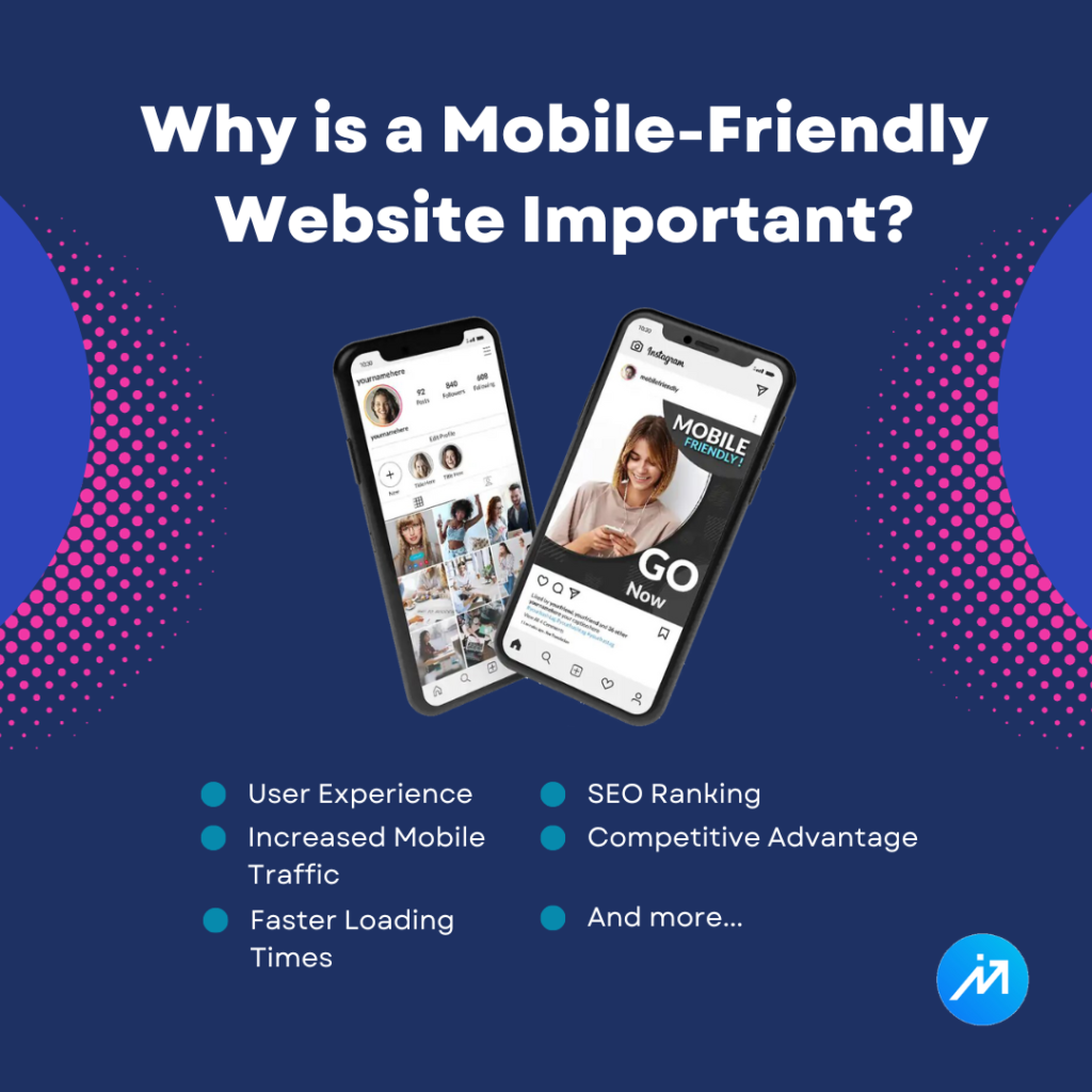
- User Experience
- SEO Ranking
- Increased Mobile Traffic
- Competitive Advantage
- Faster Loading Times
- Lower Bounce Rates
- Improved Accessibility
- Better Conversions
- Broader Audience Reach
- Adaptation to Modern Technology Trends
How to Speed Up a Website: Effective Strategies to Maximize Performance.
Do you want to know just click here
How Do I Know My Website is Mobile-Friendly?
To determine if your website is mobile-friendly, follow these steps:
- Manual Testing: Open your website on a smartphone or tablet. Check if the layout adapts to the screen size, the text is readable without zooming, and links/buttons are easy to tap.
- Google’s Mobile-Friendly Test: Use Google’s Mobile-Friendly Test tool (search “Google Mobile-Friendly Test” and enter your website’s URL) to get an instant evaluation.
- Responsiveness: Check if your website is responsive. A responsive design automatically adjusts content and layout to fit various screen sizes.
- Page Loading Speed: Use tools like Google PageSpeed Insights or GTmetrix to assess loading speed, which greatly affects mobile-friendliness.
- Mobile Usability in Google Search Console: If you have a Google Search Console account, review the “Mobile Usability” report for any issues or errors related to mobile users.
- User Feedback: Collect feedback from mobile users to identify any usability issues or areas that need improvement.
By performing these checks, you can ensure your website is mobile-friendly and provides a positive experience for visitors on smartphones and tablets.
Use Google’s mobile-friendly page tool

Google’s mobile-friendly test tool allows you to check whether a web page is mobile-friendly. This is important because Google uses mobile-friendliness as a ranking factor for search results. Here’s how you can use Google’s mobile-friendly test tool:
Access the Tool
Go to the Google Mobile-Friendly Test tool by visiting the following URL: https://search.google.com/test/mobile-friendly.
Enter the URL
In the text field provided on the tool’s page, enter the URL of the web page you want to test. Make sure to include the full URL, including the “https://” or “http://” prefix.
Click “Test URL”
After entering the URL, click the “Test URL” button. The tool will start analyzing the web page to determine if it’s mobile-friendly.
View the Results
Once the analysis is complete, you’ll see the results on the same page. It will tell you whether the page is mobile-friendly or not.
If the page is mobile-friendly, you will see a message that says, “Page is mobile-friendly,” and you’ll also get additional information about how Googlebot sees the page.
If the page is not mobile-friendly, you’ll receive information about the issues that need to be fixed, such as text that’s too small to read, links that are too close together, mobile viewport issues, etc.
Use your phone
You can check a website’s mobile-friendliness on your phone by opening your mobile browser and visiting the site. Look for responsive design elements like text that adjusts to fit the screen, images that scale properly, and easy navigation without zooming. Google’s Mobile-Friendly Test (search “Google Mobile-Friendly Test” on your browser) can also help you analyze a website’s mobile compatibility by entering its URL. Additionally, you can rotate your phone to see how the site adapts to different screen orientations. This quick assessment will give you a sense of the website’s mobile usability.
Use your desktop
To check if your website is mobile-friendly using a desktop browser, you can use built-in browser tools like Google Chrome’s Developer Tools. Simply open your website in Chrome, right-click anywhere on the page, and select “Inspect” (or press F12). In the Developer Tools panel, click the device icon (usually a phone or tablet) in the top left corner to simulate a mobile device. This will display your site as it would appear on a mobile device, allowing you to assess its mobile-friendliness, responsiveness, and any potential issues.
How can I get a mobile-friendly design as a client?

To get a mobile-friendly design as a client:
- Specify responsive design requirements.
- Choose a skilled web designer or agency.
- Prioritize user experience on mobile.
- Test on various mobile devices.
- Optimize images and content.
- Ensure fast loading times.
- Implement mobile navigation menus.
- Use readable fonts and scalable elements.
- Incorporate touch-friendly elements.
- Conduct usability testing on mobile.
What Is Involved with Creating a Mobile-Friendly Website?
- Planning
- Define your goals and objectives for the mobile version of your website.
- Understand your target audience and their mobile browsing habits.
- Decide whether to create a separate mobile website, a responsive design, or a mobile app, based on your needs.
- Responsive Design
- Responsive web design is the most common approach. It involves creating a single website that adapts to various screen sizes and resolutions.
- Use CSS media queries to define how your site should be displayed on different devices.
- Ensure that your design is flexible and fluid, allowing content to adjust to different screen sizes.
- Mobile-First Design
- Consider designing for mobile devices first, then scale up to larger screens. This approach ensures that your website is optimized for smaller screens.
- Navigation and Layout
- Simplify navigation menus and use a mobile-friendly menu icon (hamburger menu).
- Use a single-column layout to make the best use of limited screen space.
- Text and Fonts
- Use legible fonts and maintain readable text sizes.
- Avoid large blocks of text and use shorter paragraphs.
- Images and Media
- Optimize images and media for mobile devices to reduce load times.
- Use responsive images with the srcset attribute to serve different image sizes based on the user’s device.
- Touch-Friendly Elements
- Ensure that buttons and links are large enough to be easily tapped with a finger.
- Provide adequate spacing between interactive elements to prevent accidental clicks.
- Performance Optimization
- Minimize HTTP requests and reduce the use of large JavaScript files.
- Enable browser caching and utilize content delivery networks (CDNs) to enhance page loading speed.
- Testing
- Thoroughly test your website on various mobile devices and browsers to identify and fix issues.
- Use developer tools, emulators, and real devices for testing.
- Usability and User Experience
- Focus on creating a seamless user experience on mobile devices.
- Pay attention to load times, intuitive navigation, and content readability.
- Search Engine Optimization (SEO)
- Ensure that your mobile website is optimized for search engines, just like the desktop version.
- Use mobile-friendly metatags and structured data.
- Mobile-Optimized Content
- Tailor your content for mobile users. Consider shorter paragraphs and concise content.
- Use mobile-friendly formats for videos and other multimedia.
- Accessibility
- Ensure that your website is accessible to users with disabilities. Follow accessibility guidelines (e.g., WCAG).
- Regular Updates
- Continuously monitor and update your website to adapt to changing mobile devices and technologies.
- User Feedback
- Gather feedback from mobile users to make improvements to your site’s mobile-friendliness.
Creating a mobile-friendly website is an ongoing process that involves both design and technical considerations. Adhering to best practices and staying current with mobile web design trends is crucial to maintaining an effective mobile web presence.
Do searchers use mobile devices to visit your website?

Mobile device usage for web browsing has been steadily increasing for several years. This trend is likely to continue, as smartphones and tablets have become the primary devices for accessing the internet for many people.
To determine if users are accessing your specific website using mobile devices, you can use website analytics tools like Google Analytics. These tools provide information about the devices and browsers visitors are using to access your site, helping you understand your audience’s device preferences and optimize your site accordingly.
Conclusion
In conclusion, the importance of mobile-friendly website design cannot be emphasized enough. It is not just a trend; it is a necessity in the digital landscape. By investing in mobile optimization, you can improve user experiences, boost your SEO rankings, expand your audience reach, and gain a competitive edge. So, if your website is not yet mobile-friendly, now is the time to make the necessary changes and ensure that your online presence is accessible and appealing to mobile users.